


The Anatomy of Typography — Part 02

Hi there! 👋
We hope that your holiday is superb! 🎄
In this week’s newsletter, we are going to talk about the anatomy of typography. This is the second part because we have previously written about it. Check that out here. 😍
Let’s get into it!
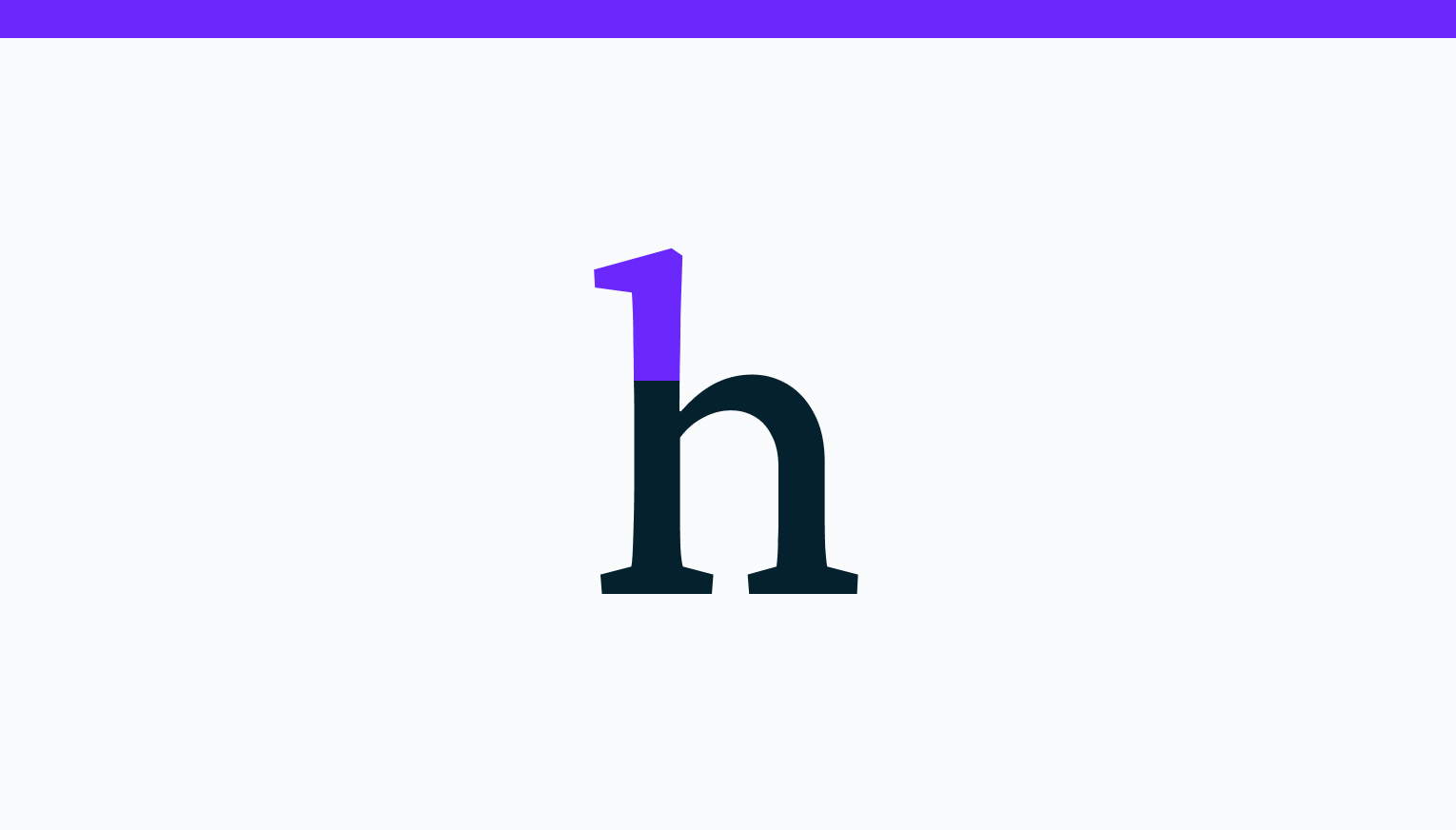
Term 01 — Ascender
An ascender is a vertical stroke that extends upwards, over the x-height.
Term 02 — Descender
A descender is a vertical stroke that extends downwards, below the x-height.

Term 03 — Bar
A bar is a horizontal stroke in letters like A, H, e, and f.

Term 04 — Serif
A serif is a short line added at the beginning and the end of strokes. Serifs are what make a typeface a serif or a sans serif.

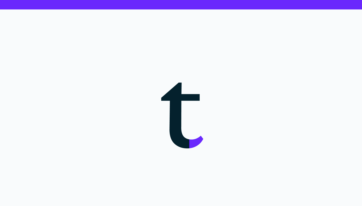
Term 05 — Terminal
When a letter doesn’t have a serif, the end of the stroke is called terminal.
Term 06 — Bowl
A bowl is a stroke that creates an enclosed curved space, like in the letters d, b, o, and B.

Well, that’s it for this week. This was the last newsletter in 2021. I hope to see you in 2022! 😍
If you’d like to learn more about the anatomy of typography, hit that like button. 🔥
See you next week! 👋
Useful Websites
Links to websites that can help you as a creative.
Fontjoy — Font pairing made simple.
Free Typography — Nicely curated high-quality free fonts.
Fonts Ninja — Free browser extension. Inspect any font on web pages.
Font In Logo — Search and find fonts used by world brands.