
The Anatomy of Typography — Part 01

Hi there! 👋
In this week’s newsletter, we are going to talk about the anatomy of typography. This is not crucial knowledge, however, if you are in the industry, it is fun to know these things, and yeah, you can also be cool 😎 in front of your friends knowing these terms.
Let’s get into it! 👇
Term 01 — Leg
A portion of a letter that extends downwards, attached at one end and free at the other.
Term 02 — Arm
A straight or curved portion of a letter that extends upwards or outwards, attached at one end and free at the other.

Term 03 — Ear
The small stroke that extends outwards from a lowercase g in some typeface styles.

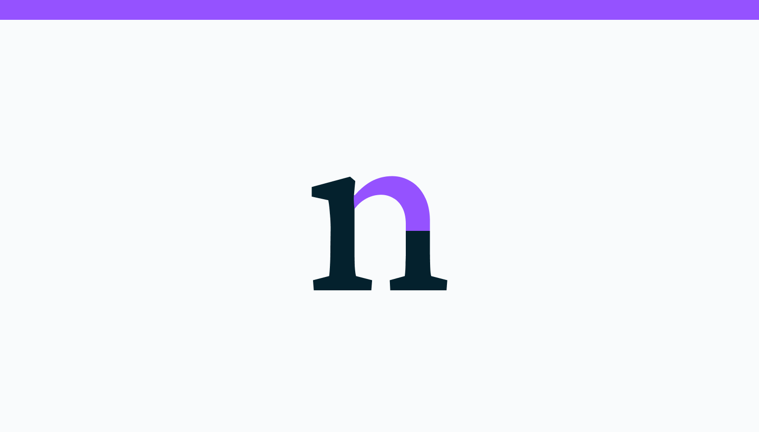
Term 04 — Shoulder
The stroke that curves downwards and to the right of the lowercase h, m, and n.
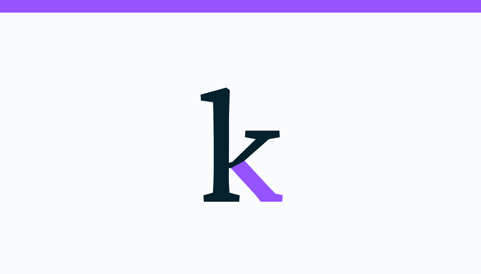
Term 05 — Tail
The decorative curved descender of a capital Q, R, and K. The descenders of the lowercase g, j, p, q, and y are also sometimes called tails.

Term 06 — Spine
The spine is the main curved stroke inside the upper and lowercase S.

Well, that’s it for this week. If you’d like to learn more about the anatomy of typography, hit that like button. 🔥
See you next week! 👋
Useful Websites
Links to websites that can help you as a creative.
Pixelarticons — Open-source pixel-art icons based on a 24x24 grid. All for FREE.
Kerntype — Cool online game. You can practice kerning with it.
Shape Type — A letter shaping online game.
Typewar — A game where you have to guess what typeface you are seeing.