
The Biggest Icon Design Mistakes

Hi there! 👋
I hope you’re having a great week! 💜
Before we jump in, I would like to announce that the waitlist is open for the UI design eBook I have been working on for a long time.

If you think this is something you’d be interested in, please check out the landing page I designed for the book and sign up for the waitlist for early access and discounts at launch.
This week’s newsletter is about icon design. It may seem easy to design a proper icon. But it isn’t. You have to pay attention to so many small details to create a good icon set.
Let’s see the mistakes! 👇
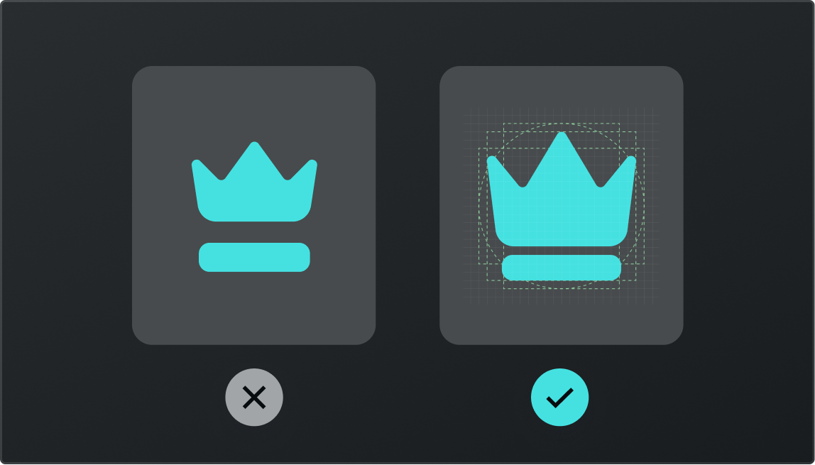
Mistake 01 — Not using a grid
One of the principles of icon design is using a grid. There are so many grid systems for icons. Look for one on the internet and use it.
Mistake 02 — Inconsistency
Consistency matters. Pay attention to using the same stroke weight through an icon set.

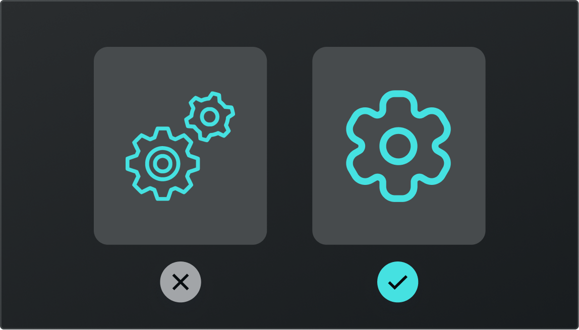
Mistake 03 — Being too complex
Avoid complexity. Try to reduce the number of details and show its minimal form, expressing only the essential characteristics.
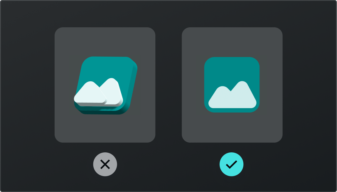
Mistake 04 — Using perspective views
Don’t overcomplicate icons with perspective views. Make it front-facing.
Mistake 05 — Not making it bold
Icons shapes should be bold, ensuring readability and clarity, even in small sizes.
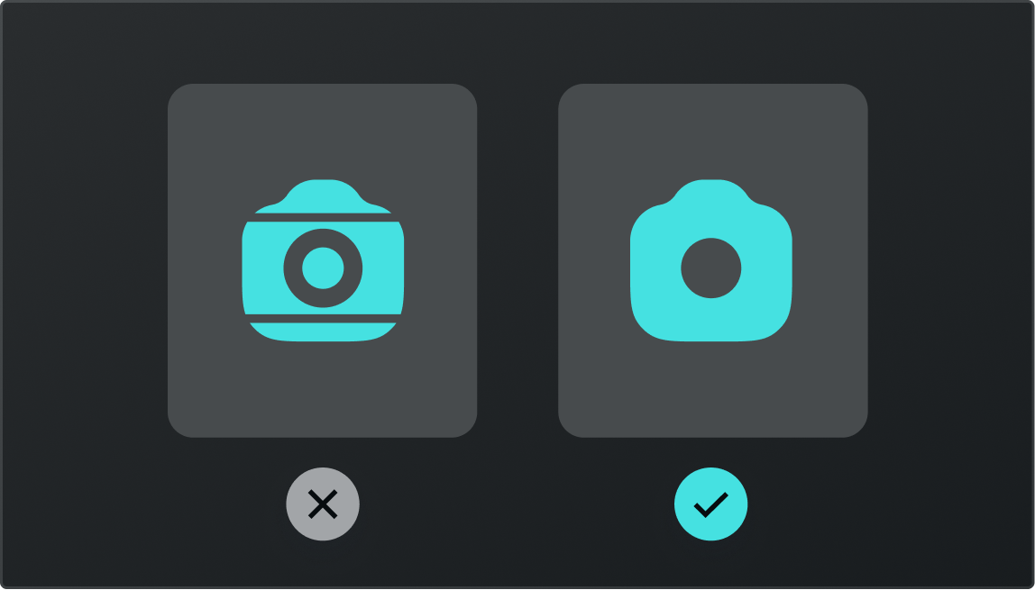
Mistake 06 — Using organic shapes
Everything should be geometric and easy to understand.

This was it for this week. 🙌
If you’ve learned something, don’t forget to like this post, and have a fantastic rest of your week! 💜