Deadly Beginner UI/UX Mistakes
Hi there! 👋
I hope you’re doing okay this week! 💜
Nowadays, I am working on the Joycon icon pack which will launch next week (hopefully hehe). So keep your eyes open! 👀
In this week’s newsletter, I will show you 6 deadly UI/UX mistakes that beginners usually make.
Let’s get into it! 👇
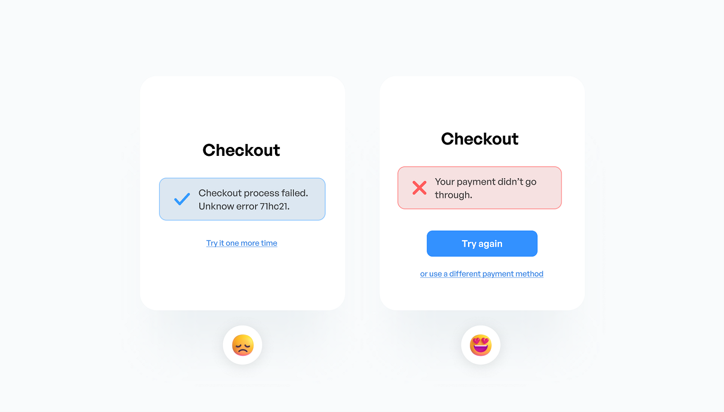
Mistake 01 — Unclear message
Every time when the user makes a mistake or an error occurs, you have to clearly inform them about what happened and what next steps can be done. Remember, when designing UIs, you design for the user and someone will use your product. Confusing interfaces can have a negative experience on the user’s experience.
Mistake 02 — Inconsistency
In a design project, consistency is key. If you have a project that looks like 3 different brands, it won’t work. For example, your primary buttons should look the same across your project. Users love a certain degree of predictability.
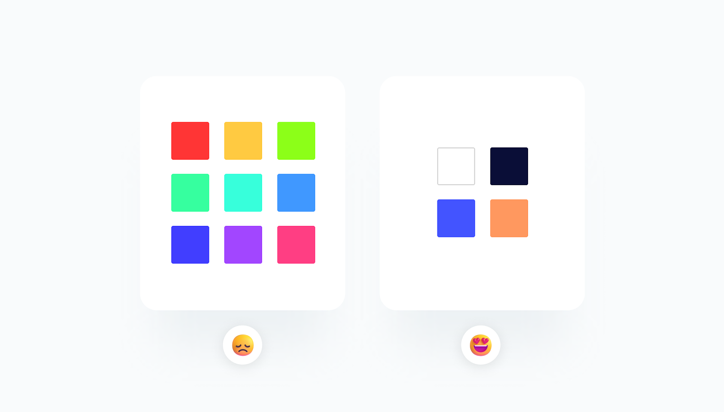
Mistake 03 — Too many colors
The good old mistake. Many beginners jump in design and start using tons of colors within a project. What we should see here, is that design has—at least it should have—a system in place. That means choosing 3-4 colors and sticking with those.
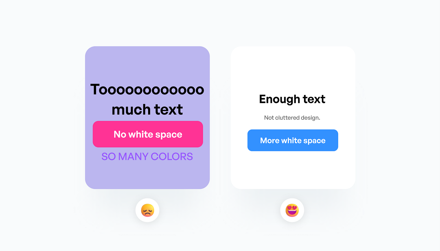
Mistake 04 — Cluttered design
Too much text, too many colors, too many images, not enough white space—just some of the red flags of a cluttered design. Let’s aim for a clear look with enough breathing room. It is never a good idea to just blindly drop everything on the frame and hit export.
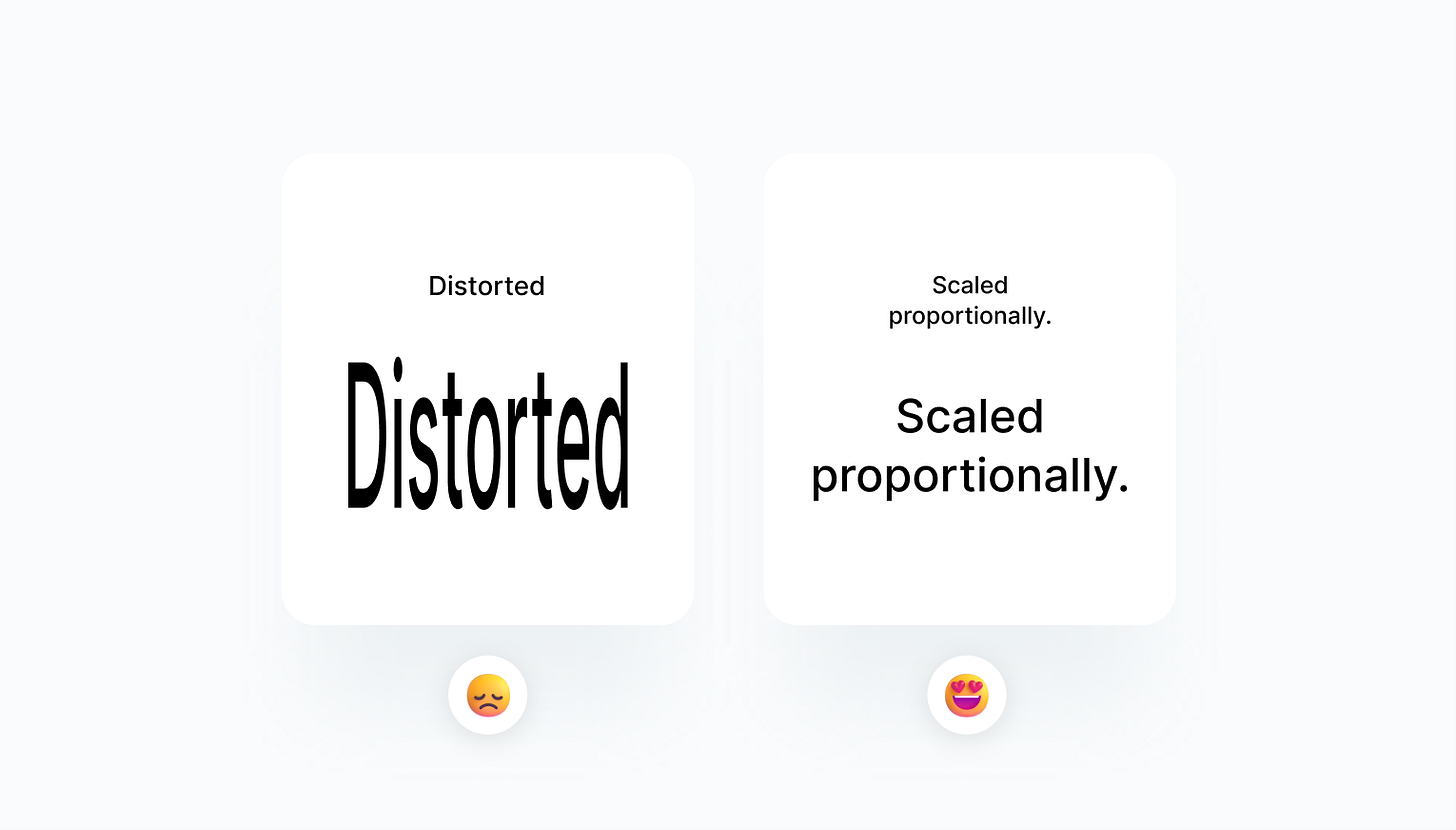
Mistake 05 — Text distorting
Sometimes you don’t have enough place for the text, actually, it happens often. What you shouldn’t do is to say “okay okay, no problem, I am just going to make the text narrower”. You can of course make the text narrower or change the font size or the line height, however, what you can’t do is make it narrower by distorting the text.
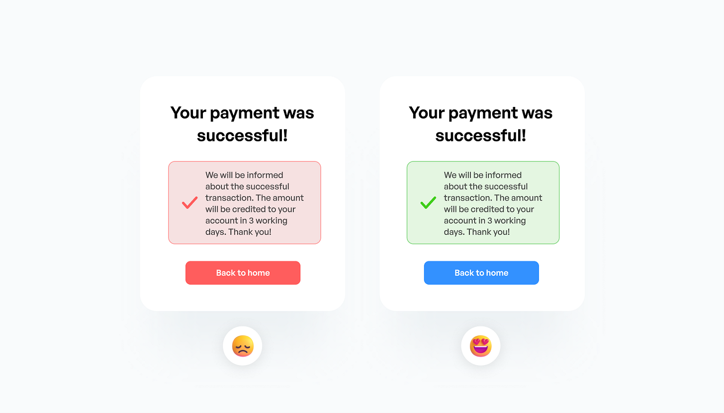
Mistake 06 — Not using appropriate colors
Imagine the scenario where you made a successful payment and the message on the left is waiting for you. You are confused for a second because your brain processes the red color first and instantly thinks “something must’ve gone wrong”. Always use the appropriate color for a given message.
This was it for this week. 🙌
If you’ve learned something, don’t forget to like this post, and have an awesome rest of your week! 💜
Useful Websites
Links to websites that can help you as a creative.
Wrrooom — Free Sketch/Figma file which allows you to create awesome illustrations.
Screenlane — Great curation of nice mobile UI designs.
Rev Kit — Free design system that can speed up your process.


