
4 Dark Mode UI Tips

Hi there! 👋
I hope you’re doing great! 💜
In this week’s newsletter, we will talk about 4 super useful tips that will improve your dark mode UI designs for sure.
Let’s get into it! 👇
You could ask, why is dark mode so popular? Well when done well, dark themes have many benefits.
They reduce eyestrain.
They are easier to read in low light.
They can greatly reduce battery consumption.
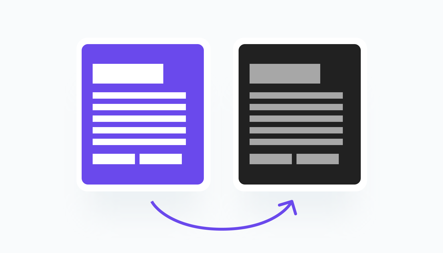
Tip 01 — Don’t convert light to dark.
Just converting the light colors to dark on your user interface won’t produce a good result. If you have a purple background, for example, you have to change that to black too, since dark mode usually requires dark color for large surfaces.
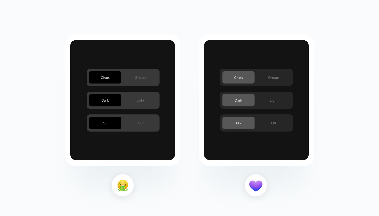
Tip 02 — Depth of the design.
When you’re using dark mode in your design, it is a good practice to make surfaces brighter that is closer to the user. So for example, a card on a black background should be brighter so it creates a sense of depth.
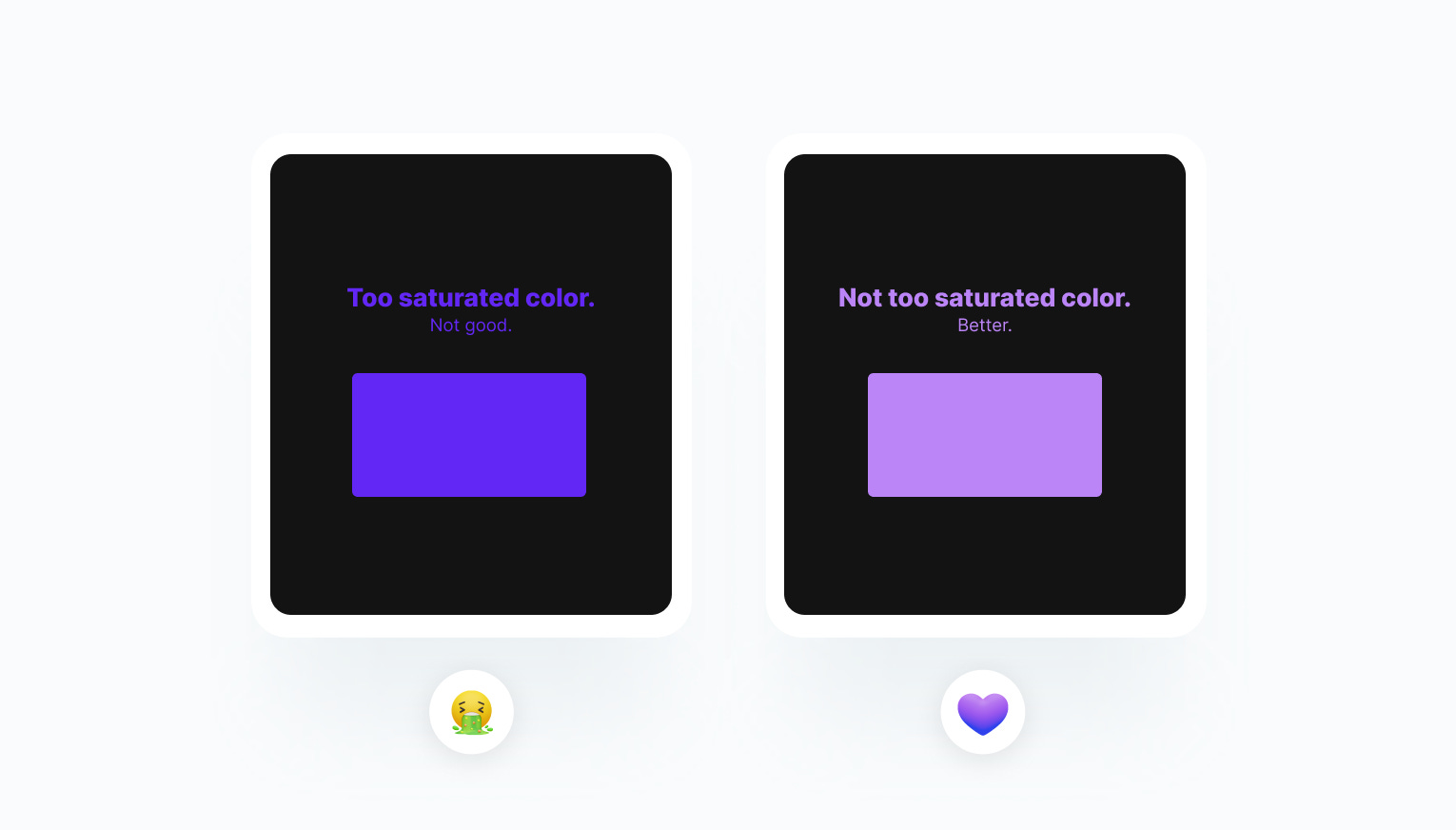
Tip 03 — Don’t use saturated colors.
Colors that are overly saturated, won’t work really great together with other dark elements. It is better to use less saturated colors from your color palette to improve legibility.
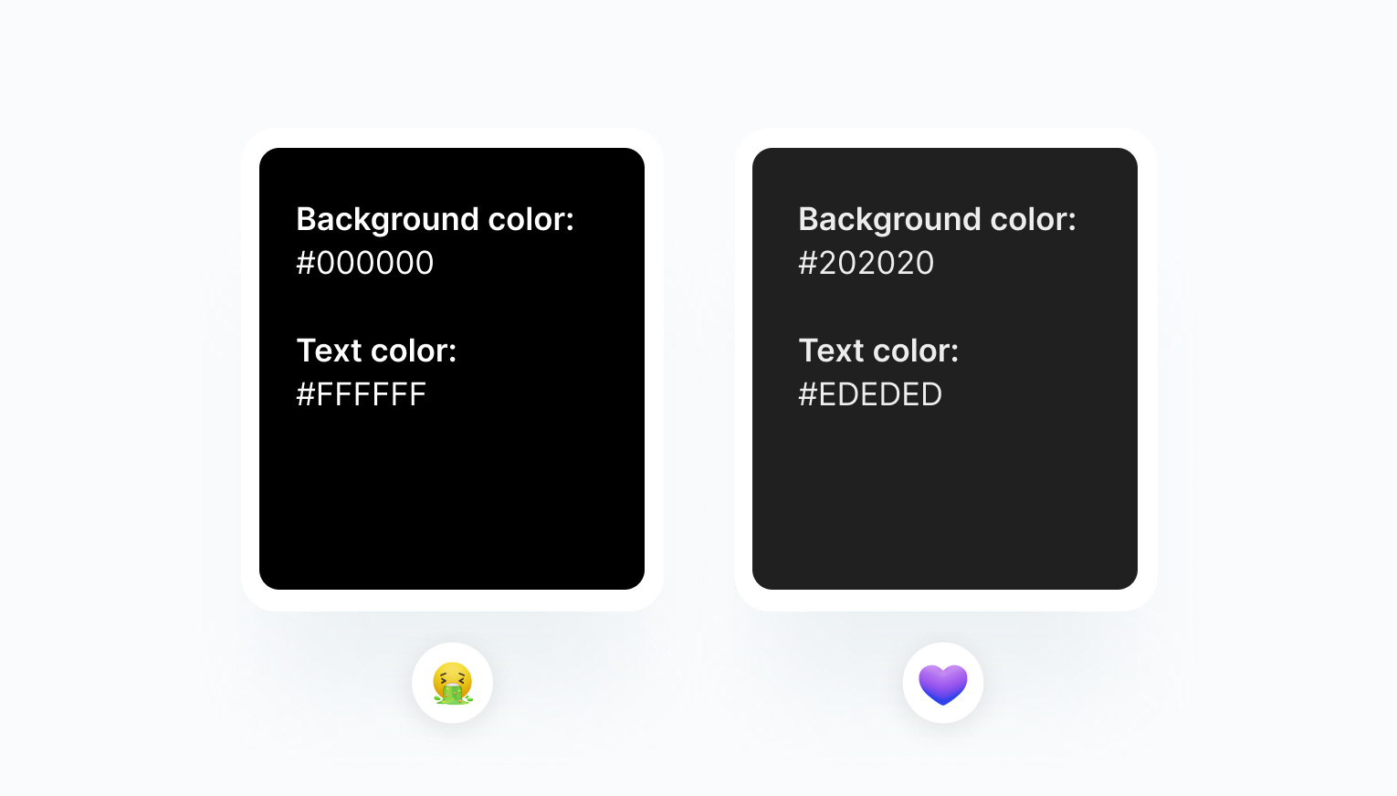
Tip 04 — Avoid using pure black or white.
Using pure with or black causes the user’s eyes to work harder to adapt to the brightness. It is better to have less contrast. So instead of using #000000 pure black, you can use #202020, which is just a bit brighter than black, but still makes a difference.
This was it for this week. 🙌
If you’ve learned something, don’t forget to like this post, and have an awesome rest of your week! 💜
Useful Websites
Links to websites that can help you as a creative.
unDraw — Beautiful SVG illustrations that you can use completely free.
Color Contrast Checker — Check your color contrast with this tool to design accessible interfaces.
Shortcuts.design — Every shortcut for designers in one place.